
Hey everyone!
With this blog, I am starting a new series of blogs where we will be discussing design patterns in React. I will be covering the most common design patterns used in React applications and will guide you on how to implement them in your applications as well (as I continue to learn and implement them myself).
So in this blog we will be discussing Compound Components. This is a very common design pattern used in React applications that allows you to create composable components that can work together elegantly. This pattern is very useful when you want to create a set of components that are related to each other and need to share some state or behavior between them. Let's start with an example.
Example
Let's say we have a Card component:
type CardProps = {
title: string;
description: string;
author: string;
};
export const Card = ({ title, description, author }: CardProps) => {
return (
<div className="card">
<h2>{title}</h2>
<p>{description}</p>
<p>By {author}</p>
<div className="card-actions">
<button>Like</button>
<button>Share</button>
</div>
</div>
);
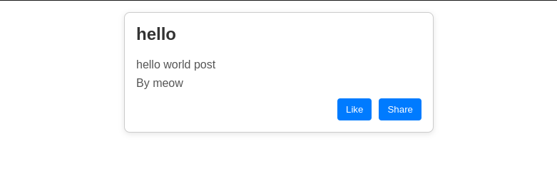
};which looks like this (ignore the styling part as it is not important for this blog):
Let's say my application has multiple pages where I am using different variants of this card component. For example, on the profile page I am hiding the like and share buttons, on the home page I am showing the like button, and on some other pages I am extending the card component to show some other information. So you might think we should pass some boolean props such as showLikeButton and showShareButton to the Card component to control the visibility of these buttons and similar for other information. The code of the card component will look like this:
type CardProps = {
  title: string;
  description: string;
  author: string;
  showLikeButton: boolean;
  showShareButton: boolean;
};

export const Card = ({ title, description, author }: CardProps) => {
  return (
    <div className="card">
      <h2>{title}</h2>
      <p>{description}</p>
      <p>By {author}</p>
      <div className="card-actions">
        {showLikeButton && <button>Like</button>}
        {showShareButton && <button>Share</button>}
      </div>
    </div>
  );
};
It might seem like the usual way to do things, but if we want more control over how our data is displayed and the ability to add extra info to our components, we can run into some issues. Passing around a bunch of boolean props can get messy and make it tough to keep track of the button states. Instead, we can try using the Compound Components pattern. This way, we can create a group of related components that work well together. Let’s take a closer look at how this works!
What are Compound Components?
As I mentioned earlier, Compound Components are a design pattern in React that allows you to create a set of components that work together. The main idea is to create a parent component that manages the state and behavior of its child components. This way, you can create a more flexible and reusable set of components. It can be visualized something like this:
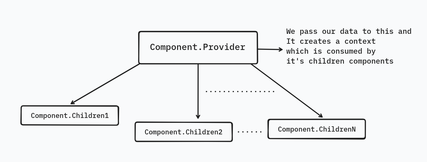
You might not be able to grasp the concept yet, but don't worry! We'll break it down step by step. The main goal of this pattern is to create a set of components that can work together and share state and behavior. This way, you can create a composable set of components.
Step-1: Context Setup
The first step is to create a context for our Card component, which will enable us to share state and behavior among its child components. This context will allow the children to access the card's state and behavior easily.
import React, {
  createContext,
  useContext,
  ReactNode,
  FunctionComponent,
} from "react";

type CardContextType = {
  title: string;
  description: string;
  author: string;
  likesCount?: number; // I extended the card component to show likes count
  shareCounts?: number; // and share counts as well
};

const CardContext = createContext<CardContextType | null>(null);

const useCardContext = () => {
  const context = useContext(CardContext);
  // this will ensure that context is not null or the subcomponents are not used outside the provider
  if (!context) {
    throw new Error("Card.* components must be used inside <Card.Provider />");
  }
  return context;
};
Step-2: Create the Card Component
Now we will create a card component that will act as a parent component for all the child components. This component will provide the context to its children and manage the state and behavior of the card.
type CardProps = {
  children: ReactNode;
  title: string;
  description: string;
  author: string;
  likesCount?: number;
  shareCounts?: number;
};

export const Card: FunctionComponent<CardProps> & {
  Title: typeof CardTitle;
  Description: typeof CardDescription;
  Author: typeof CardAuthor;
  LikeButton: typeof CardLikeButton;
  ShareButton: typeof CardShareButton;
} = ({ children, ...cardData }) => {
  return (
    <CardContext.Provider value={cardData}>
      <div className="card">{children}</div>
    </CardContext.Provider>
  );
};
Step-3: Create the Child Components and attach them to the Card Component
Now we will create child/subcomponents that will consume the context provided by the Card component. These components will be responsible for rendering the card's title, description, author, and action buttons (like and share). And to make it composable we will attach these components to the Card component itself.
const CardTitle = () => {
  const { title } = useCardContext();
  return <h2>{title}</h2>;
};

const CardDescription = () => {
  const { description } = useCardContext();
  return <p>{description}</p>;
};

const CardAuthor = () => {
  const { author } = useCardContext();
  return <p>By {author}</p>;
};

const CardLikeButton = () => {
  const { likesCount } = useCardContext();
  return <button>Like ({likesCount ?? 0})</button>;
};

const CardShareButton = () => {
  const { shareCounts } = useCardContext();
  return <button>Share ({shareCounts ?? 0})</button>;
};

Card.Title = CardTitle;
Card.Description = CardDescription;
Card.Author = CardAuthor;
Card.LikeButton = CardLikeButton;
Card.ShareButton = CardShareButton;
And voila! We just created a compound component, composable component that can be used in multiple ways. The final code will look like this:
import React, {
  createContext,
  useContext,
  ReactNode,
  FunctionComponent,
} from "react";

// 1. Context
type CardContextType = {
  title: string;
  description: string;
  author: string;
  likesCount?: number;
  shareCounts?: number;
};

const CardContext = createContext<CardContextType | null>(null);

const useCardContext = () => {
  const context = useContext(CardContext);
  if (!context) {
    throw new Error("Card.* components must be used inside <Card />");
  }
  return context;
};

// 2. Subcomponents
const Title = () => {
  const { title } = useCardContext();
  return <h2>{title}</h2>;
};

const Description = () => {
  const { description } = useCardContext();
  return <p>{description}</p>;
};

const Author = () => {
  const { author } = useCardContext();
  return <p>By {author}</p>;
};

const LikeButton = () => {
  const { likesCount } = useCardContext();
  return <button>Like ({likesCount ?? 0})</button>;
};

const ShareButton = () => {
  const { shareCounts } = useCardContext();
  return <button>Share ({shareCounts ?? 0})</button>;
};

// 3. Main Card component with subcomponents attached
type CardProps = {
  children: ReactNode;
  title: string;
  description: string;
  author: string;
  likesCount?: number;
  shareCounts?: number;
};

const Card: FunctionComponent<CardProps> & {
  Title: typeof Title;
  Description: typeof Description;
  Author: typeof Author;
  LikeButton: typeof LikeButton;
  ShareButton: typeof ShareButton;
} = ({ children, ...data }) => {
  return (
    <CardContext.Provider value={data}>
      <div className="card">{children}</div>
    </CardContext.Provider>
  );
};

// 4. Attach subcomponents and export
Card.Title = Title;
Card.Description = Description;
Card.Author = Author;
Card.LikeButton = LikeButton;
Card.ShareButton = ShareButton;

export { Card };
Usage
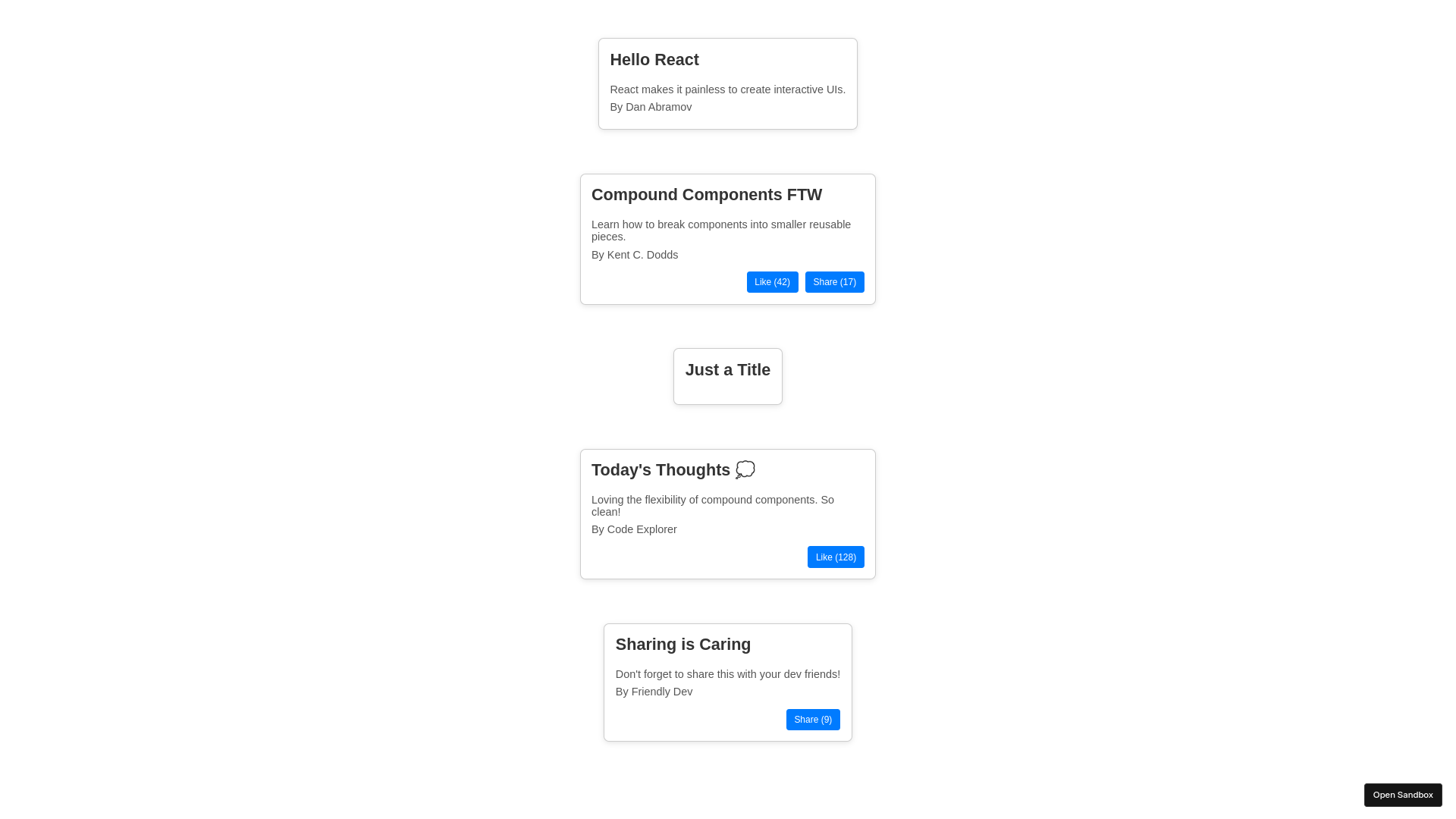
Now that we have created our compound component, here are different variations that can be composed without having to pass any props to the Card component:
import React from "react";

import {
  Card
} from "./Card";

function App() {
  return (
    <div className="app" style={{ padding: "2rem", display: "grid", gap: "2rem" }}>
      {/* Variation 1: Basic Card */}
      <Card
        title="Hello React"
        description="React makes it painless to create interactive UIs."
        author="Dan Abramov"
      >
        <Card.Title />
        <Card.Description />
        <Card.Author />
      </Card>

      {/* Variation 2: Card with Like and Share */}
      <Card
        title="Compound Components FTW"
        description="Learn how to break components into smaller reusable pieces."
        author="Kent C. Dodds"
        likesCount={42}
        shareCounts={17}
      >
        <Card.Title />
        <Card.Description />
        <Card.Author />
        <div className="card-actions" style={{ marginTop: "1rem" }}>
          <Card.LikeButton />
          <Card.ShareButton />
        </div>
      </Card>

      {/* Variation 3: Minimalist */}
      <Card
        title="Just a Title"
        description=""
        author=""
      >
        <Card.Title />
      </Card>

      {/* Variation 4: Social Post Style */}
      <Card
        title="Today's Thoughts 💭"
        description="Loving the flexibility of compound components. So clean!"
        author="Code Explorer"
        likesCount={128}
        shareCounts={22}
      >
        <Card.Title />
        <Card.Description />
        <Card.Author />
        <div className="card-actions" style={{ marginTop: "1rem" }}>
          <Card.LikeButton />
        </div>
      </Card>

      {/* Variation 5: Share-only Card */}
      <Card
        title="Sharing is Caring"
        description="Don't forget to share this with your dev friends!"
        author="Friendly Dev"
        shareCounts={9}
      >
        <Card.Title />
        <Card.Description />
        <Card.Author />
        <div className="card-actions" style={{ marginTop: "1rem" }}>
          <Card.ShareButton />
        </div>
      </Card>
    </div>
  );
}

export default App;
and here's a preview of how it looks (ignore the styling part and yes I used ChatGPT to create these variations and styling):
Conclusion
This might seem like a lot of work for a simple card component, but the real power of compound components becomes apparent in more complex scenarios where components need to share state or behavior. This pattern allows you to build a flexible and reusable set of components that can be composed in different ways, without the need to pass a large number of props manually.
However, it's important to note that using this pattern for very simple components can add unnecessary complexity. It's all about how you want to structure your components and how much control you need over their internal behavior.
The compound components pattern is especially useful when:
- You have a group of related components that need access to shared data or state.
- You want to provide a flexible API that gives consumers control over the structure and layout.
- You want to avoid "prop drilling" and make the components easier to compose.
That said, not every component needs to use this pattern. For simpler, isolated components with minimal shared logic, a straightforward prop-based design is often more appropriate. Ultimately, it's about choosing the right pattern for the complexity and scale of your UI—use compound components when the benefits of shared context, composition, and flexibility outweigh the added setup.
Alright, that’s all for this blog! I hope you found it helpful. Catch you in the next one with something new and exciting. Until then, have a good one!
Bye! 🐱